Hi!
I’m new to YOLO models and have been playing around with tuning my model with the tuning module. One of the outputs is the tune_scatter_plots.png and I was wondering what the color scale indicates on these plots?
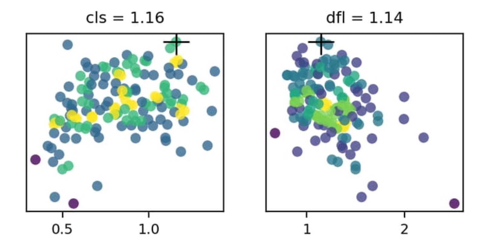
I’m quite certain the x-axis indicates the hyperparameter value and the y-axis the fitness but I can’t seem to figure out with the color indicates. There is no color scale given nor can I found information about it in the documentation.
Anybody know? Thanks
Great question — you’ve got the axes right. The point colors encode sample density, not fitness. We compute a 2D histogram of hyperparameter value (x) vs fitness (y) and color each point by how many trials fell into its bin, using the Viridis colormap. The black “+” marks the best configuration found. You can see this in the plt_color_scatter implementation used by plot_tune_results in the plotting reference, and the tuning guide briefly describes the generated tune_scatter_plots.png.
If you’d like a visible color scale, you can quickly recreate one plot with a colorbar:
import pandas as pd
import matplotlib.pyplot as plt
from ultralytics.utils.plotting import plt_color_scatter

df = pd.read_csv("runs/detect/tune/tune_results.csv")
v, f = df["lr0"].to_numpy(), df["fitness"].to_numpy()
plt_color_scatter(v, f, bins=40, cmap="viridis")
plt.xlabel("lr0"); plt.ylabel("fitness")
plt.colorbar(label="sample density")
plt.show()
Thanks so much @pderrenger!! I want to re-tune my model now but I want to only vary the hyperparameters that seem to have a significant effect on the model accuracy. I was hoping I could use these plots to determine which hyperparameters are relevant but I can’t really seem to figure out a way to extract that info from these plots. Would you know how?
To me it seems like most of the plots are all fairly randomly and uniformly distributed. Perhaps the only thing I can deduce from this plot that i should maybe keep the mosaic hyperparameter under 1. Would you agree that these plots don’t tell me that much (in terms of deciding which hyperparameters are important)? I also don’t really see how the color scale would be useful to me in this case.
Hope you have some insights! But thanks either way!
Since the y-axis is the fitness, the highest point on the plot should represent the “best” setting for a given setting. As an example, the cls and dfl settings should be configured with cls=1.16 and dfl=1.14, as indicated above the plots and using the cross marker on the plot itself.
Hi @BurhanQ , thanks for the reply. Yes, I’m aware that the black cross indicates the best score from this tuning run, as also mentioned by @pderrenger. However, I want to refine the tuning to improve it. As I was varying quite a number of parameters, the black cross does not necessarily mean it’s the best possible setting for that parameter, it merely shows what the value of the parameter is for the best combination of settings of all combinations tested. But the good fitness score could have been more influence by other parameters. Therefore, I am interested in finding trends within the plots to determine which one have a larger effect on the fitness score. But as you can see from the plots, there isn’t much of a trend for any of them.
I’m pretty sure the issue is that I’m varying too many parameters at once, which causes the effects to kind of cancel each other out, so i think i should try varying only a few at a time. Or is there a better way to do it?
I see what you’re saying. Yeah, there’s going to be inherit randomness in the values b/c they are a bit randomized in the parameter search. Varying multiples settings all at once does make it more difficult to determine which one(s) had the best influence.
I think a few things could try:
- Carry out more
tune runs to see if any clearer trends appear
- Select a few parameters with the ‘best’ fitness results, and do some experiments iterating those values (I would start with the values that had the biggest delta from default)
- Determine what you might not want to modify, for instance
fliplr looks like it performs best with a value of fliplr=0.404 but maybe your dataset isn’t ideal to use the fliplr hyperparameter
Additionally, have you trained with the default configuration? I’m wondering how much the tuning has helped compared to the default settings? If the best you saw in tuning was an mAP of ~0.38, but you get ~0.37 with default settings, then maybe it doesn’t make sense to change all that much?
Ok, clear. Thanks for the tips!
Happy to help! I’m sure others would appreciate hearing how everything goes once you finish your experiments!